CASE STUDY
Project Brief
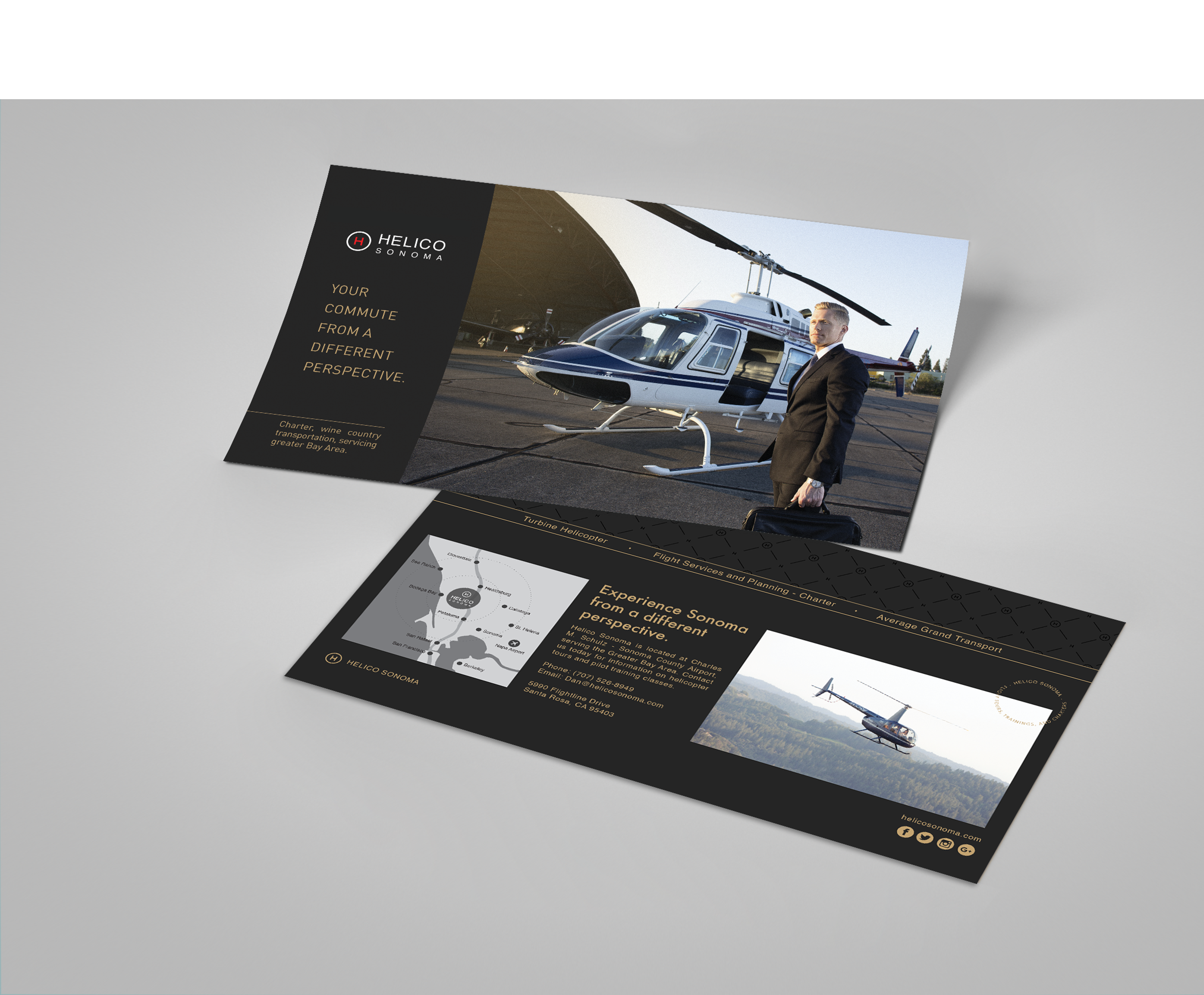
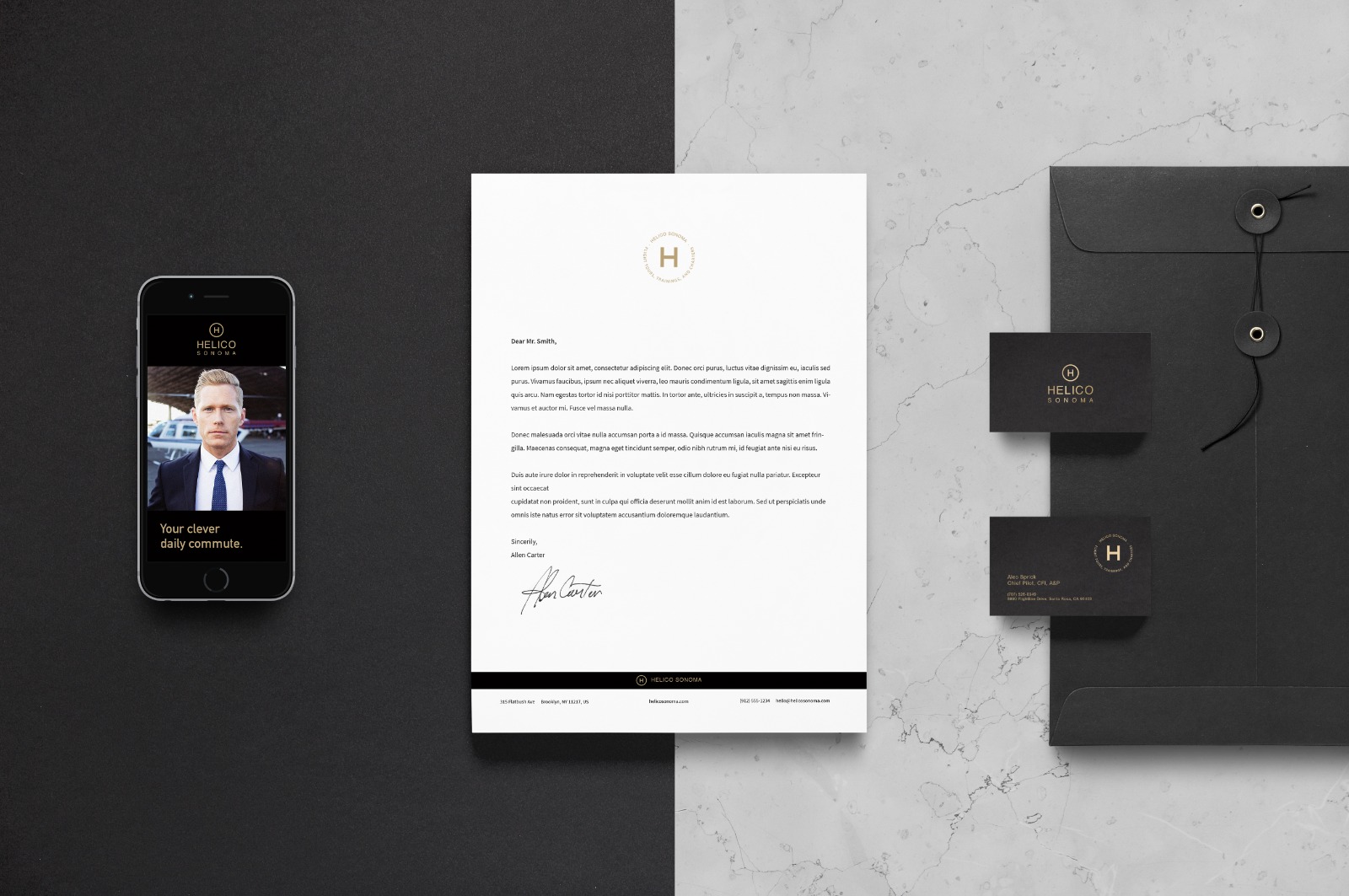
Helico Sonoma is the only tour and flight instruction company in the Wine Country. Now offering charter flights, the company wanted to change their brand perception to attract high-end executives with little time to waste.
Problems
-
The logo displayed an amateur look.
-
Change the brand perception to attract hi-end clients.
-
The brand was not cohesive across all touch points.
-
Lack of brand personality.
-
No clear creative direction for marketing.
-
Lack of professional editorial photography.
Solution
Instead of following the local trends, they became the trend. They are the modern look on a sea of outdated labels, that have been produced for decades, and never changed.
Understanding the Audience
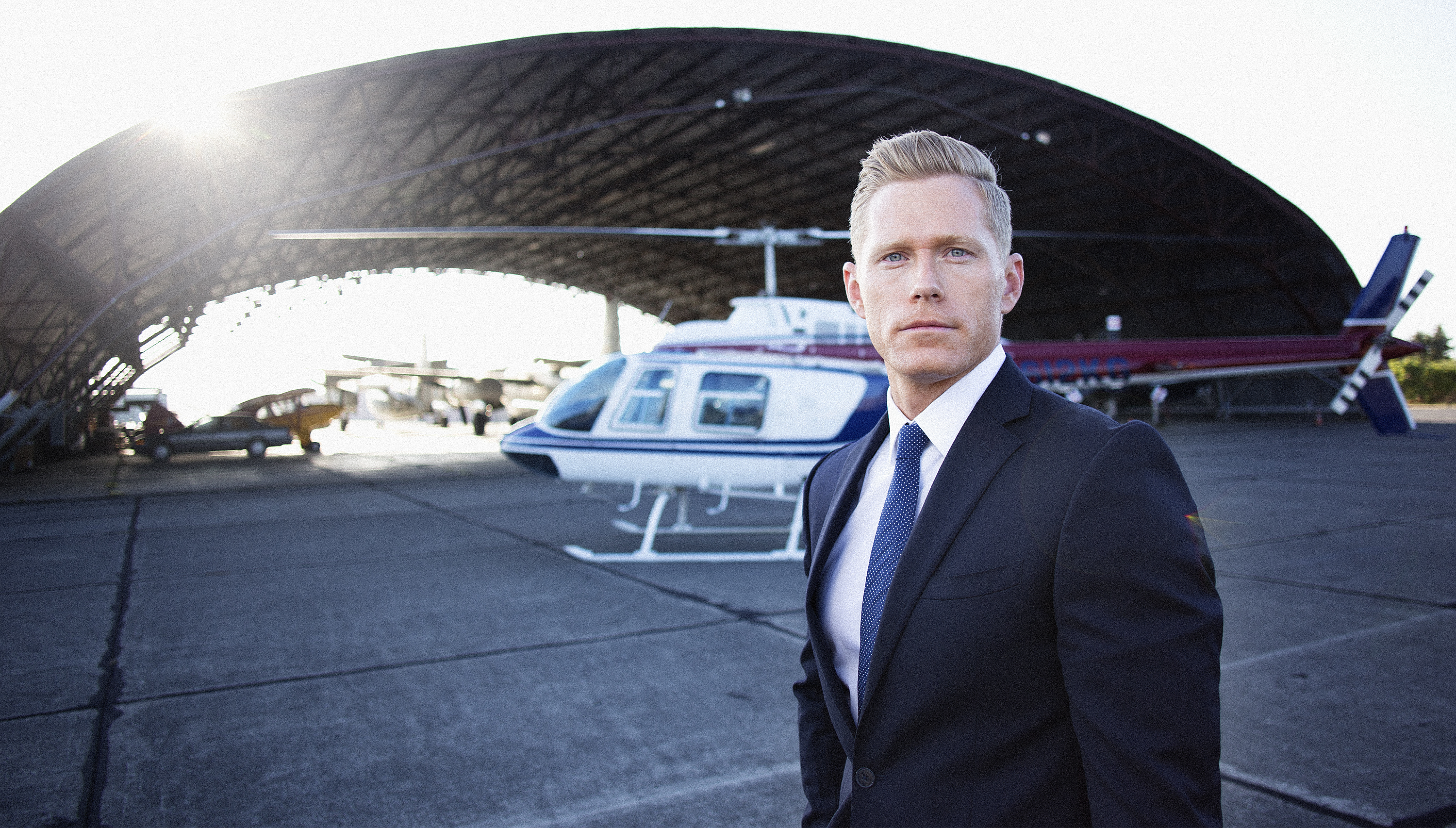
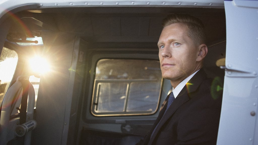
For the adventurous executives and for those looking for a lifetime experience, Helico Sonoma passion for the sky and Helico Sonoma targeted audience is demanding adventurous executives. They have little time to waste, refined taste, appreciate great quality, and is attracted to luxurious brands like Rolex and Mercedes. They appreciate exclusive hotels like Calistoga Ranch, in the wine country.s led with the same passion for the sky.

Understanding the Audience
Helico Sonoma targeted audience is demanding adventurous executives. They have little time to waste, refined taste, appreciate great quality, and is attracted to luxurious brands like Rolex and Mercedes. They appreciate exclusive hotels like Calistoga Ranch, in the wine country.
Understanding the Brand
For the adventurous executives and for those looking for a lifetime experience, Helico Sonoma passion for the sky and professionalism brings freedom and a different perspective on life. With high-quality aircraft, Helico Sonoma is a celebration of life and efficient. At the core of the brand is a simple philosophy: Safety and Adventure. Every flight is led with the same passion for the sky.
“To attract adventurous executives, Helico Sonoma brand was rooted in professionalism and safety, ”
B R A N D D I R E C T I O N
Original Logotype
The Logo is inspired by a helipad. According to the client, the logotype looked very amateur, since it was made
by one of the partners. The word SONOMA is not aligned, there are two different typefaces, and the thick lines
give it a rough look.
Brand Colors
The color palette in this project was inspired by the sea, the sun, the bold color scheme, accentuates power.
Raven Black
Golden
Vette Red
Brand Direction Boards
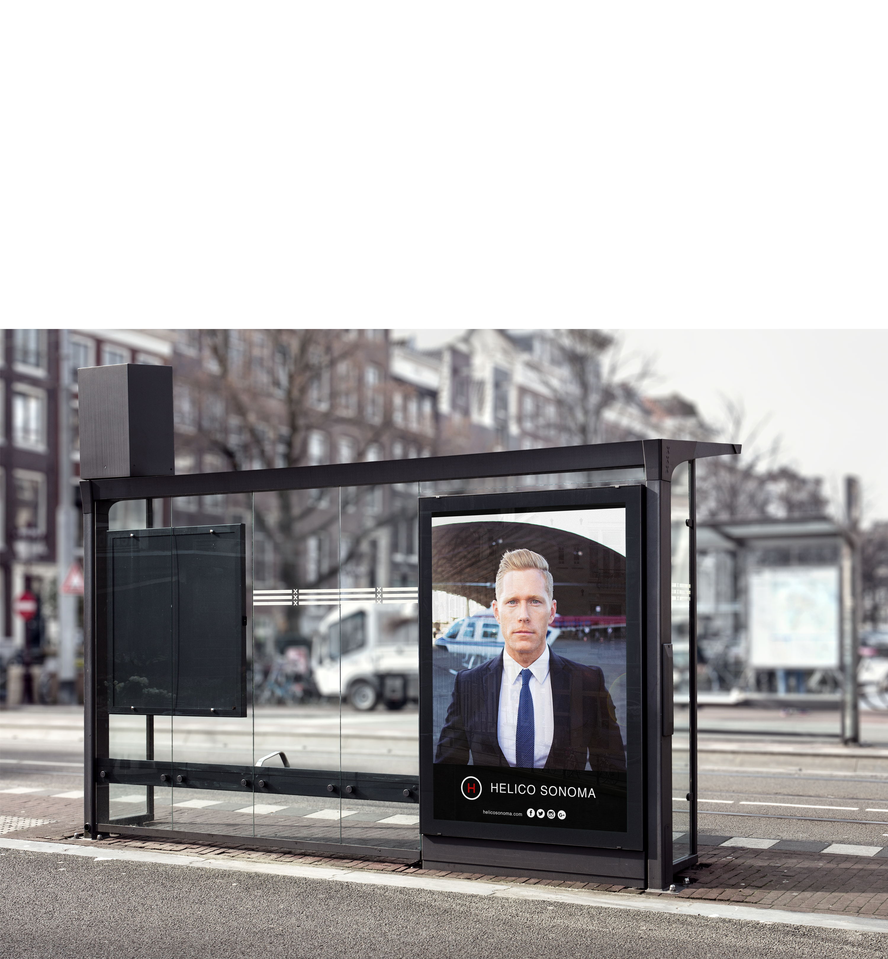
Based on customer’s profiles, business direction, the new market they want to reach, and all information gathered from the strategy session, we created 3 boards that represents 3 distinctive directions for the brand. At this phase, the client chooses what boards represents better their business. We create the boards based on ideas, keywords, insights from the strategy discovery sessions.
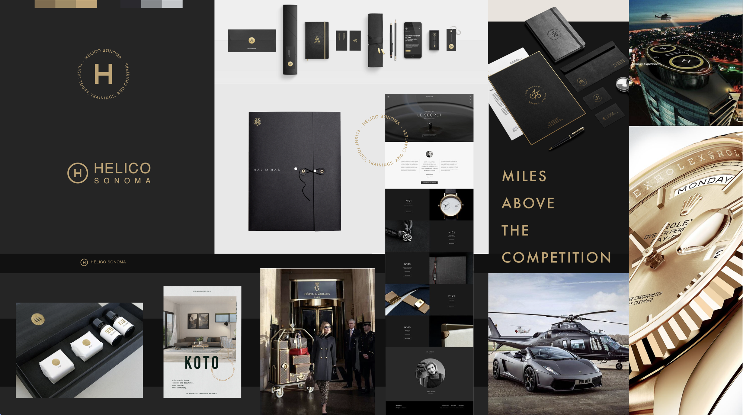
lux·u·ri·ous
ˌləɡˈZHo͝orēəs,ˌləkˈSHo͝orēəs/
This is the direction the client chose. It is inspired by the power and the extraordinary. It is designed to attract high-end executives that value time and exclusive experiences. It positions Helico Sonoma as a luxurious company designing a future of abundance. It is intended to attract those who appreciate quality above anything, and deserve the status Helico Sonoma can provide.

Brand Archetype
Archetypes help to craft brand’s personality. Helico Sonoma is dependable and adventurous – here to inspire others to explore and reach their dreams.

THE HERO
aka The Warrior, The Super Hero.
THE EXPLORER
aka The Seeker, The Wanderer
They promote TRIUMPH and FREEDOM.
Their story relates to those who appreciate quality above anything else (like The Super Hero) and the taste for adventure (like The Explorer). Helico Sonoma provides safety and experience so that your customers feel supported as they try new and exciting things.
The archetype was a great inspiration for the photographer. He took the pictures inspired by the Hero and the hero pose.